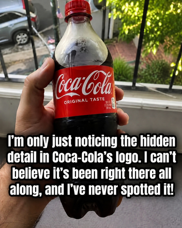
Have you ever looked at the Coca-Cola logo and suddenly noticed something you’ve never seen before? 👀🥤
For more than a century, Coca-Cola’s famous red-and-white logo has been one of the most recognizable brand logos in the world. But recently, people online have been pointing out a strange detail hidden within the familiar lettering.
Some say it looks like a tiny Danish flag.
Once you see it, it’s surprisingly difficult to unsee.
But is Coca-Cola hiding a secret inside its logo—or is your brain simply playing a clever visual trick?
The Hidden Danish Flag in the Coca-Cola Logo
The detail people are talking about appears around the flowing letters in the Coca-Cola wordmark.
Because the logo uses white, sweeping script against a bright red background, certain intersections between the letters can create a shape that resembles a white cross on a red field.
And that looks remarkably similar to the Danish flag, known as the Dannebrog. 🇩🇰
That’s what makes this logo mystery so fascinating.
A logo you’ve probably seen hundreds or thousands of times can suddenly appear completely different once someone points out the hidden shape.
Is the Danish Flag Actually Hidden There?
Here’s where the mystery gets interesting.
There is no reliable evidence that Coca-Cola intentionally designed a Danish flag into its original logo.
The famous Coca-Cola lettering was created in the late 1800s using Spencerian script, an ornate handwriting style that was popular in American business writing at the time.
The flowing letters contain loops, curves, and overlapping strokes.
When those strokes meet the red background in just the right way, they can create shapes that our brains interpret as familiar objects.
So the Danish flag appears to be much more likely a visual coincidence than a secret message.
Why Does Your Brain See a Flag?